
Selecting the right furniture for your home involves more than just picking out styles that appeal to you. The colors you choose for your furniture can dramatically affect the mood, harmony, and overall aesthetic of your space. By understanding and applying the principles of color theory, you can create a home environment that feels cohesive, inviting, and visually pleasing. Whether you’re aiming for a calm sanctuary, a vibrant family room, or a sophisticated lounge, color theory offers practical guidance for making confident furniture choices.
Calm and Relaxing Hues
When you want to create a calming atmosphere, certain colors perform better than others. Soft blues, muted greens, and gentle grays are known for their serene qualities, making them excellent choices for bedrooms, reading nooks, or any area where relaxation is a priority. Incorporating these hues in furniture—such as a pastel-blue sofa or sage-green armchair—can help reduce stress and promote tranquility. The soft undertones of these shades provide an understated elegance that suits modern and traditional interiors alike, setting the stage for restful spaces that feel like a retreat from the world.
Energetic and Invigorating Tones
In contrast, some rooms benefit from a livelier color palette. Bright reds, oranges, and yellows are associated with vitality and enthusiasm, making them suitable for social spaces such as kitchens or living rooms. Choosing furniture in these stimulating shades can foster a sense of energy and warmth, encouraging laughter, conversation, and activity. A vibrant ochre chair or a bold crimson accent piece can serve as the visual centerpiece of a room, ensuring that the space feels lively without becoming overwhelming.
Sophistication Through Neutrals
Neutrals remain a cornerstone in color theory due to their versatility and timelessness. Colors such as beige, taupe, charcoal, and ivory provide a sophisticated backdrop that allows other design elements to shine. Furniture in these shades can tie a diverse room together or provide a subtle foundation for more colorful accessories. The beauty of neutral furniture is that it adapts easily to changing décor trends, offering long-term flexibility while maintaining an air of understated elegance.
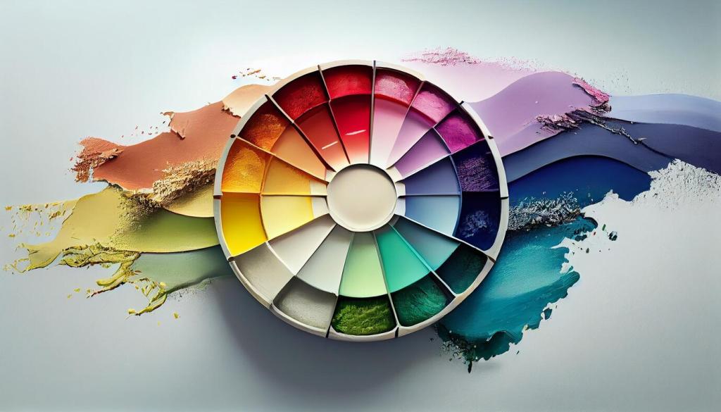
Understanding Color Harmony in Furniture Arrangement
Complementary Contrast for Visual Interest
Complementary colors sit opposite each other on the color wheel, such as blue and orange or purple and yellow. Using this principle, you can combine furniture pieces in contrasting hues to create focal points within a room. For example, placing a deep blue sofa opposite a burnt orange armchair draws attention and enlivens the space. However, balance is essential—using too many bold contrasts can overwhelm the senses. By limiting the number of competing pieces and anchoring surrounding elements with neutrals, you maintain visual excitement without sacrificing cohesion.

Analogous Combinations for Smooth Flow
Analogous color schemes use hues next to each other on the color wheel, such as green, teal, and blue. Furniture in these related shades aspires to create harmony and continuity, making transition between spaces feel seamless. Arranging a teal loveseat with forest-green chairs and blue accessories produces a calming effect while still offering enough variation to keep the room visually engaging. This approach works particularly well in open-plan layouts, where maintaining a smooth flow between functional areas is important.
Matching Furniture Finishes and Textures with Color Theory
The Warmth of Wood Tones
Wooden furniture introduces organic warmth and natural color variations into your design scheme. Lighter woods like maple or oak integrate seamlessly with cool and pastel color palettes, while richer tones such as walnut or cherry pair beautifully with deep, saturated hues. Understanding the undertones of your wood finishes—whether they lean warm (yellow, red) or cool (gray, blue)—is crucial for achieving a cohesive look. When these finishes are chosen to harmonize with wall colors and textiles, the effect is inviting and grounded.
Playing with Metals and Glass
Metal and glass furniture pieces add an element of shine and modernity, reflecting surrounding colors and amplifying the natural light in the room. The finish of metallic elements—whether brushed gold, chrome, bronze, or matte black—should be selected based on the existing color palette. Cool metals like chrome or steel accentuate blues and greens, while warmer metals such as gold pair well with reds and yellows. Glass, with its transparency, adapts to any color scheme and helps to lighten visual weight, providing balance among heavier or more colorful furniture.
The Tactile Appeal of Upholstery
Upholstered furniture offers endless possibilities for color and texture, allowing you to play with both subtlety and bold statements. Velvet in jewel tones creates luxurious focal points, while linen in earth tones brings understated comfort to a space. Applying the principles of color theory, you can either match upholstery colors to existing room tones for unity or choose contrasting shades to introduce energy. Variation in fabric textures, from nubby weaves to smooth leathers, deepens the sensory experience and makes the color palette feel more nuanced.